Role
UX Design, UI Design
Tools used


Duration
3 Weeks
Challenge
The challenge was to design a comprehensive desktop betting app that catered to both esports and sports enthusiasts, ensuring ease of use, seamless navigation, and a data-rich experience for highly active bettors.
Overview
RivalryBet is a desktop app designed for esports and sports enthusiasts, offering a seamless and engaging experience. The goal was to create an all-in-one platform with a diverse selection of games, community features, and game insights. Its intuitive design ensures smooth navigation, allowing users to place bets and interact with ease.
User Research & Insights


User interviews
To better understand how bettors engage with their platforms of choice, what challenges they face, and what features they value most, user interview were conducted with experienced sports bettors and esports enthusiasts, analyzing their behaviours, frustrations, and needs.

Journey Mapping
To gain more insight into the user journey, we mapped out how bettors navigate their betting platforms, identifying key decision points, frustrations, and opportunities for improvement. This step provided a clearer understanding of user behaviours at each stage, from browsing matches to placing bets and staying engaged over time
Competitive Analysis
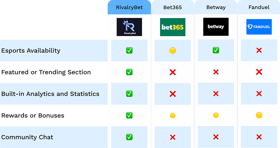
Competitor Analysis
The current most popular betting platforms were evaluated using a competitor analysis chart to find features, usability, and user engagement deficiencies. The availability of esports, analytics tools, prizes, and community engagement were evaluated as key factors to identify areas that could use improvement.
User Personas
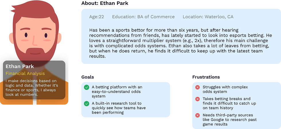

User Personas
User personas were created as a means to represent the needs, behaviours, and frustrations of different types of bettors. These user personas helped identify key pain points that many bettors may have, such as confusing odd systems, lack of esports options, and difficulty in researching past matches and statistics.
Concept Development & I.A

.png)
Information Architecture
The information architecture was designed to create a structured and intuitive navigation system, ensuring users can easily access key features such as betting options, promotions, news, results, and community engagement.
Concept Development
During the concept development phase, 3 main categories were focused upon to adhere to user pain points. The betting experience, user engagement, and rewards. Ideas were explored under these categories like expanding esports, community chats, and implementing a rewards system.
Style Guide


Style Guide
The style guide was created to provide a unified and aesthetically pleasing UI while conserving accessibility and usability. To provide a unified design language throughout the platform, a structured colour palette, typography system, and grid layout were developed.
Sketches


Sketches
During the sketching phase, the focus was on visualizing layout ideas and structuring the user experience across different devices. Sketches were created to explore navigation, feature placement, and overall usability before refining the design further.
Wireframing & Prototyping


Hi-Fidelity Wireframes
The high-fidelity wireframing stage focused on refining the visual design aspect, interactive elements, and overall user experience. Building on the low-fidelity structures, these designs incorporated the colour palette and typography of the style guide. High-fidelity wireframes ensure that the interface is both visually appealing and functionally intuitive.
-
Desktop App High-Fidelity Wireframe
-
Mobile App High-Fidelity Wireframe
-
Tablet App High-Fidelity Wireframe
Low-Fidelity Wireframes
The objective of the low-fidelity wireframing stage is to define user flows and structure layouts before implementing design elements. In order to provide a clear and seamless user experience, these wireframes gave usability, information organization, and navigation first priority.
-
Desktop App Low-Fidelity Wireframe
-
Mobile App Low-Fidelity Wireframe
-
Tablet App Low-Fidelity Wireframe
Prototyping
During the prototyping stage, the goal was to prioritize creating an interactive experience to simulate real users. Components such as clickable buttons, variants for hovers, overlays from shared bets, scrollable content, and smooth transitions through screens. Prototyping helped refine user flows, test interactions, and ensure the final experience felt intuitive and responsive.
User Testing & Iterations
User Testing
The user testing was conducted with a heatmap to evaluate usability, engagement, and navigation. The results revealed key focus areas such as:
-
Unused space on the right side of the header
-
Unused space on the right side of the betting contents
-
Unused space in the chatbox
-
A linear scanning pattern on the navigation panel


Iterations
Based on the results, several design improvements were made for navigation and engagement.
-
The header was balanced by spacing out ‘Promotions, News, Results’ and adding a search option for better accessibility.
-
A ‘View’ button was added on the betting content for easier interaction
-
Spacing lines were implemented in the navigation panel to improve content separation.
Final UI & Mockups
Final UI
Nearing the end, the final UI design includes refined layouts, seamless navigation, and interactive elements to improve the overall user experience. Clear content hierarchy, smooth betting interactions, and engaging community elements were achieved.


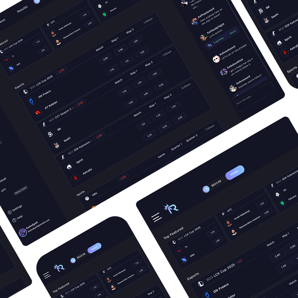
Animated Desktop App Walk-through
A walkthrough showcase of the completed RivalryBet Desktop App. Highligthing the content, overlays, and the visual design. The walkthrough provides a realistic representation of what users experience while browsing the app.

Mockups
A mockup showcase of the final UI design presents the desktop app in a realistic-scenario. Illustrating the UI throughout 3 separate platforms.


Results
The RivalryBet Desktop App yielded positive results:
Increased User Engagement:
Users had positive feedback on the idea of a chat community implementation, along with analytics and rewards.
Improved Navigation and Accessibility:
The navigation panel received positive feedback, allowing users to quickly search for games along side a search bar.
Better Content Visibility:
Overall spacing to keep content clean and discoverable was met with positive feedback from regular bettors
Enhanced Betting Experience:
All bettors veteran or beginner responded well to the odds system, keeping it a simple multiplier. Addition of larger esports pool.
Conclusion
The RivalryBet sports betting app has redefined the online betting experience for users of all expertise. By prioritizing key pain points of sports betting users, RivalryBet was capable of becoming more engaging and accessible for users. Overall, RivalryBet enhanced the user's experience.

Thank You!
For sparing some time and reviewing my work.